CSS Flexbox #8. The flex-wrap Property
Until now, you have seen that flex-items stay on the same line, regardless of the content inside them and the space available.
With the flex-wrap property, it is possible to make flex-items wrap over to the next line.
Let’s demonstrate this property with an example.
Step #1. Create the HTML
- Open your preferred code editor.
- Create an empty HTML file.
- Visit this page, copy the HTML code and save the file.
Step #2. Create the CSS
Let’s add some basic styling.
- Create an empty CSS file and call it style.css (this file is already linked in the HTML code)
- Add this code to the file:
/* GLOBAL STYLES */ * { box-sizing: border-box; } body { background-color: #AAA; margin: 0px 50px 50px; } .item { padding: 2rem; border: 5px solid #87b5ff; border-radius: 3px; font-size: 2em; font-family: sans-serif; font-weight: bold; background-color: #1c57b5; }
Step #3. The CSS Flexbox Styles
It is time to declare the main container as a flex-container.
- Edit the CSS code:
.container { display: flex; background-color: #f5ca3c; }
Each flex-item is now as wide as the content inside it. You need now to declare the “width” of each flex-item, based on the flex-basis property.
- Edit the CSS code:
.item1 { flex-basis: 50%; } .item2 { flex-basis: 50%; } .item3 { flex-basis: 80%; } .item4 { flex-basis: 100%; }
Each item has now a predefined width, but they stay regardless of that on the same line. This is where the flex-wrap property is useful.
- Edit the CSS code:
.container {
display: flex; background-color: #f5ca3c; flex-wrap: wrap; }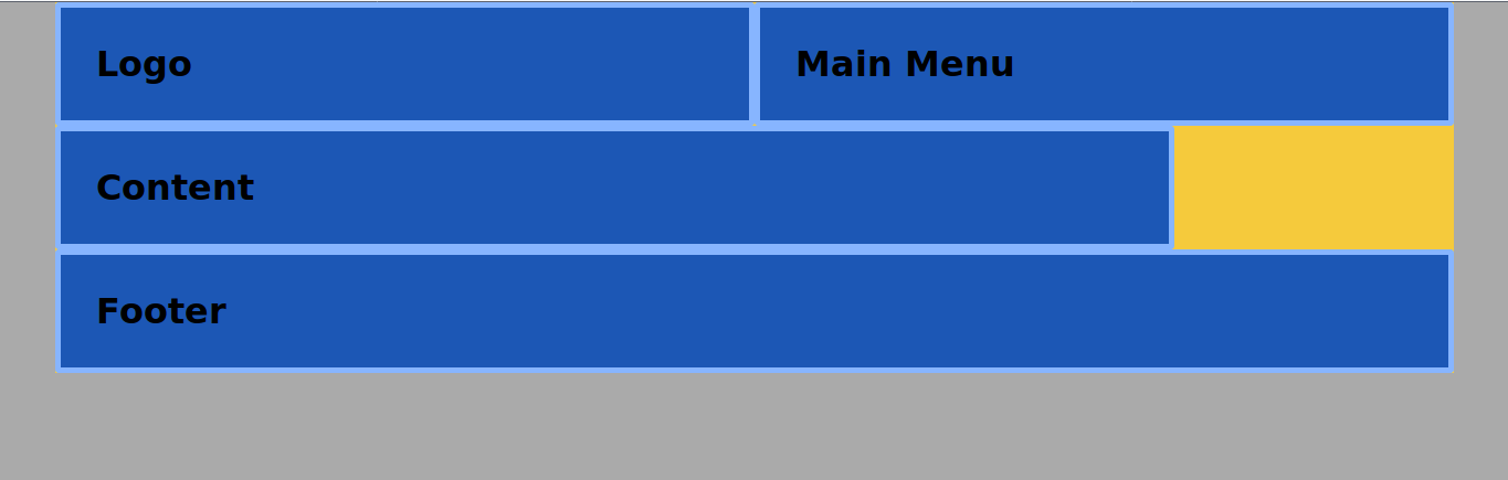
Now each item has its proper width and is placed according to it on the “proper” line. Let’s center the content item on the main axis.
- Edit the CSS code:
.item3 { flex-basis: 80%; margin: auto; }
The flex-wrap property has two other possible values:
nowrap(this is the default value).wrap-reverse(inverts the order of start and end on the cross (secondary) axis.- Edit the CSS code:
.container {
display: flex;
background-color: #f5ca3c;
flex-wrap: wrap-reverse;
}
Conclusion
The flex-wrap property allows you to wrap items onto the next line, that way you have control over the placement of flex-items and can easily achieve your desired layout.
Thanks for reading!
Previous tutorials of this series
- CSS Flexbox #1. Creating Your First Flexbox Layout
- CSS Flexbox #2. How to Use the justify-content Property
- CSS Flexbox #3. The align-items Property
- CSS Flexbox #4. The flex-grow Property
- CSS Flexbox #5. The flex-shrink Property
- CSS Flexbox #6. The flex-basis Property
- CSS Flexbox #7. The order Property