CSS Flexbox #1. Creating Your First Flexbox Layout
At the end of 2018, we published a book about CSS Grid, the layout tool that is revolutionizing the frontend web-design. CSS Grid is entirely native to CSS and allows you to create a grid-based layout system, using columns and rows.
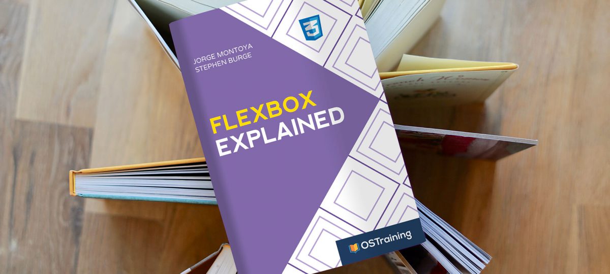
“CSS Grid Explained” immediately became one of our best-selling books. So we’re working on a large update and expansion for that book. We’re also starting to produce a new book, “Flexbox Explained”. Flexbox is closely related to CSS Grid, but there are noticeable differences:
- Flexbox is a one-dimensional layout model. It can manage either columns or rows.
- CSS Grid is a two-dimensional layout model. It can manage both columns and rows.
Over the next few weeks, we’re going to publish a series of Flexbox tutorials as we write “Flexbox Explained”. This first tutorial demonstrates the basic concepts of CSS Flexbox with practical examples.
Introduction to Flexbox
The CSS Flexbox specification describes a layout with items (flex-items) inside a container (flex-container). These items can grow or shrink in width and/or height, according to the available container space. The items “flex” to fit the parent container in the best possible way.
These “flexed” items can be laid out in any direction (inline axis or block axis), thus providing a lot of flexibility when changing the size (width or height) of the screen or its orientation.
You can take a look at the Flexbox W3C specification by clicking this link.
Step #1. Create the HTML
Let’s start this example by creating an HTML file with some sample code. I’ve prepared some HTML for you – it’s a container with 3 child elements.
- Open your preferred code editor.
- Create an empty HTML file.
- Visit this page and copy the HTML code
- Paste that code in your HTML file.
Step #2. Create the CSS
Now that we have a container with 3 elements, let’s add some styling.
- Create a CSS file called style.css.. Place this file in the same folder as your HTML file. The link to this CSS file is already in the tag of your HTML file
- Copy and paste this code, which is also available on Codepen:
/* GLOBAL STYLES */ * { box-sizing: border-box; } body { background-color: #AAA; margin: 0px 50px 50px; } .item { padding: 2rem; border: 5px solid #87b5ff; border-radius: 3px; font-size: 2em; font-family: sans-serif; font-weight: bold; background-color: #1c57b5; }This image shows how your code will appear when you open the HTML file in a browser. The 3 child items are as wide as their parent container. The height is determined by the content of each item. Notice the padding of 2rem (about 32px on a desktop screen) on all sides.

Step #3. The CSS Flexbox Styles
Now it’s time to start the Flexbox portion of this tutorial.
- Edit the CSS file and add this code:
.container { display: flex; }This image shows how your code will look now:

What has changed? On the technical side, the parent container is now a flex-container. The child elements have turned into flex-items.
Why has the size of the containers changed? The flex-items are not as wide as their parent container. They are now as wide as the content inside them. The flex-items appear as floated elements to the left. They behave like inline elements.
To clearly see the width of the parent container, you can apply a background-color:
- Edit the CSS code and add this code:
.container { display: flex; background-color: #f5ca3c; }Here’s how the container now appears:

You already have noticed that the flex-container behaves (mostly) like a block-level element. However, we an also make the container behave like an inline-level element. To do this, we change the value of the display property to inline-flex.
- Edit the CSS code:
.container { display: inline-flex; background-color: #f5ca3c; }The flex container is now an inline-level element, as you can see in this image:

Before we continue in this tutorial, let’s change the behavior to a block-level element.
- Edit the CSS code:
.container { display: flex; background-color: #f5ca3c; flex-direction: row-reverse; }Step #4. Changing Flexbox Rows to Columns
So far, we’ve created a flex-container. We’ve also seen how the children of this container behave when turned into flex-items.
Now let’s learn how to change the direction of our layout. The default direction of a flex-container is row-based. However, you can change this behavior with the flex-direction property.
- Edit the CSS code:
.container { display: flex; background-color: #f5ca3c; flex-direction: row; }After updating your code, you will see no change because flex-direction: row is the default value. Let’s make a really visible change: edit the direction of the flex-container to column.
- Edit the CSS code:
.container { display: flex; background-color: #f5ca3c; flex-direction: column; }This next image shows the change in your layout:

Now the direction of the flex-container is based on the block axis (column). The flex-items are aligned from top to bottom and each one of these items takes the full width of its parent container. So, they behave like block elements.
Now, you may start to question things at this point: “Hey, my layout now looks exactly the same as the very first layout in this tutorial!” That’s true. Visually, there’s no difference between this current layout with a flex-container and the first layout of this example with a block container.
However, we now have more control. For example, you can invert the direction of flex-items with the row-reverse and column-reverse properties.
- Edit the CSS code:
.container { display: flex; background-color: #f5ca3c; flex-direction: column-reverse; }This image shows how your layout will look after this new update:

To see the flex-items inverted in a row, change the value of the flex-direction property.
- Edit the CSS code:
.container { display: flex; background-color: #f5ca3c; flex-direction: row-reverse; }
Flexbox Summary
Congratulations! You have learned how to declare a flex-container. You have seen how flex-items behave depending on the flex-direction applied to their parent container (row or column). Also you know how to reverse the order of flex-items.
All these changes are done with CSS, so it will not affect the structure of the HTML markup of your site. That is one of the advantages of using Flexbox. Inverting the order of flex-items is just one of the features of this CSS module. There is a lot more to learn about Flexbox, so look out for Part #2 of this tutorial in a few days.
More tutorials of this series
- CSS Flexbox #2. How to Use the justify-content Property
- CSS Flexbox #3. The align-items property
- CSS Flexbox #4. The flex-grow Property