CSS Flexbox #10. The flex Shorthand Property
In the previous tutorials of the “CSS Flexbox” series, you learned that the flex-grow property specifies how items expand relative to each other to fill up the available remaining space within the flex-container.
You also learned that flex-shrink sets how items shrink relative to each other if there is not enough space available within the flex-container. The flex-basis property assigns a fixed, ideal width (or height) to the flex-items.
All these properties can be summed up in one shorthand property, the flex property.
Let’s take a look at an example!
Step #1. – Create the HTML
- Open your preferred code editor.
- Create an empty HTML file.
- Visit this page, copy the HTML code and save the file.
Step #2. – Create the CSS
Let’s write some code for the basic styles:
- Create a file called style.css (the file is already linked in the tag of the HTML code).
- Copy and paste this code:
/* GLOBAL STYLES */ * { box-sizing: border-box; } body { background-color: #AAA; margin: 0px 50px 50px; } .item { padding: 2rem; border: 5px solid #87b5ff; border-radius: 3px; font-size: 2em; font-family: sans-serif; font-weight: bold; background-color: #1c57b5; }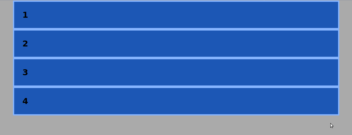
Step #3. – The Flexbox Styles
The first thing you need is to declare the flex-container.
- Edit the CSS code:
.container { display: flex; background-color: #f5ca3c; }
Each one of the items is a flex-item now. Use the flex-basis property in order to declare an initial “ideal” width for each flex-item.
- Edit the CSS code:
.item { flex-basis: 150px; }
Each one of the flex-items is 150px wide by default however, there is uncovered space in the flex-container. To solve this, we use the flex-grow property.
- Edit the CSS code:
.item { flex-basis: 150px; flex-grow: 1; }
Each one of the items takes the same amount of available space in proportion to its siblings.
When reaching a container width of less than 600px, the items will shrink proportionally to each other. That is because the flex-shrink property value is 1 by default. The layout will remain unchanged if you add this property-value pair to the code.
- Edit the CSS code:
.item { flex-basis: 150px; flex-grow: 1; flex-shrink: 1; }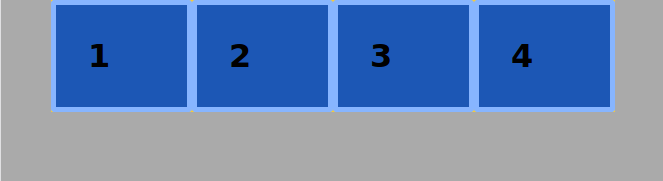
Target the first item and set its flex-shrink property to 3.
- Edit the CSS code:
.item1 { flex-shrink: 3; }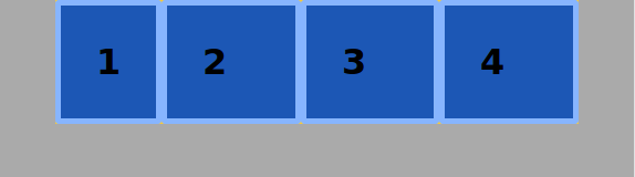
The flex Shorthand Property
The three properties assigned to the .item class can be shortened in one line using the flex shorthand property. You have to enter the values in this order:
flex-growflex-shrinkflex-basis
- Edit the CSS code:
.item { flex: 1 1 150px; }- Resize your browser window to test the code. You will see no difference in the layout. Your code on the other side seems much cleaner.
I hope you liked this tutorial. Thanks for reading!
Previous tutorials of this series
- CSS Flexbox #1. Creating Your First Flexbox Layout
- CSS Flexbox #2. How to Use the justify-content Property
- CSS Flexbox #3. The align-items Property
- CSS Flexbox #4. The flex-grow Property
- CSS Flexbox #5. The flex-shrink Property
- CSS Flexbox #6. The flex-basis Property
- CSS Flexbox #7. The order Property
- CSS Flexbox #8. The flex-wrap Property
- CSS Flexbox #9. The align-content Property
very well written. Nice explaination