CSS Flexbox #13. Create a Navigation Menu with Flexbox

The navigation speeds up the search of your users within your site. With CSS Flexbox, it is quite practical to code a basic navigation bar without the need of using floats or complicated pixel calculations.
Keep reading this tutorial in order to learn how. Let’s start!
Step #1. The Layout

The navigation bar consists of an unordered list with 9 links. There are 2 groups of links. The first 6 links take the user to different pages of the site. The last 3 are represented by icons. They take the user to her profile page, to the shopping cart or helps the user to close the session (in that order).
The layout has 3 breakpoints:
- screens wider than 1001px – Desktop
- screens from 481px to 1000px – Tablet
- screens narrower than 480px – Mobile
Step #2. Create the HTML
- Open your preferred code editor.
- Create an empty HTML file.
- Visit this page, copy the HTML code and save the file.
Notice the use of Google Fonts and FontAwesome in the head tag of the HTML code.
a { color: white; font-weight: 300; letter-spacing: 2px; text-decoration: none; background: rgb(238, 13, 13); padding: 20px 5px; display: inline-block; width: 100%; text-align: center; } a:hover { background: rgba(238, 13, 13, 0.75); }
Step #3. Create the CSS
Let’s write some basic styles first:
- Create a file called style.css (the file is already linked in the tag of the HTML code).
- Copy and paste this code:
/* GLOBAL STYLES */ * { box-sizing: border-box; } body { font-family: 'Fira Sans', sans-serif; margin: 0; }
You pull the font family directly from Google Fonts here. The box-sizing property tells the browser to consider the width of all elements with their borders included.
This part of the code focuses on the styling of the link elements. The inline-block value converts the link elements (normally inline) into “block” elements, just without a line break between blocks.
.main { max-width: 1200px; margin: 0 auto; padding: 0 3em 1.5em; } .navigation ul { border: 1px solid rgb(212, 20, 20); list-style: none; margin: 0; padding: 0; }
The main wrapper will be centered on the page and will have a max-width of 1200px.

Step #4. The Flexbox Styles
The Desktop Layout
- Edit the CSS code in order to turn the unordered list into a flex container:
.navigation ul { border: 1px solid rgb(212, 20, 20); list-style: none; margin: 0; padding: 0; display: flex; }

The list elements are now flex items. In order to make them take the whole available space within the container, you have to use the flex property on the list items.
- Edit the CSS code:
.navigation li { flex: 3; }

As you learned in this tutorial, the flex shorthand property with only one numeric value defaults to flex-grow.
You might be wondering about the value 3 instead of 1 (that would do the same). Notice that the 3 last icon links don’t need that much space at all and it would be much nicer if they were closer together. So it is a good idea to target them separately.
- Edit the CSS code:
.navigation .user { flex: 1; }

The Tablet Layout
You need to write a media query for the tablet layout. The flex items wrap over to the next row. Each one of the first 6 page links takes 50% of the available space within the container, whereas the icon links take one-third of the available space so they are all 3 onto the same row.
- Edit the CSS code:
@media all and (max-width: 1000px) { .navigation ul { flex-wrap: wrap; } .navigation li { flex: 1 1 50%; } .navigation .user { flex: 1 1 33.33%; } }

The Mobile Layout
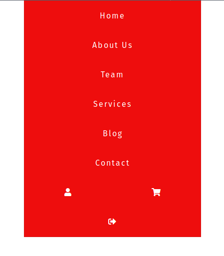
You need a media query for the mobile layout the same as with the tablet layout. Each list item will take up the whole container space. You have to set the flex-basis value to 100%. The flex-grow and flex-shrink values were already declared in the tablet media query.
Edit the CSS code:
@media all and (max-width: 480px) { .navigation li { flex-basis: 100%; } }

The original design shows the mobile layout icons on 2 rows, with the last icon occupying the whole container width.
- Edit the CSS code:
@media all and (max-width: 480px) { .navigation li { flex-basis: 100%; } .navigation .user { flex-basis: 50%; } }

The last item takes up the whole container space because it inherits the flex-grow value from the tablet media query.
I hope you had fun coding your navigation bar. Apart from the flex container declaration, you used only 3 CSS Flexbox properties to create this layout. That speaks for the ease of use and fun you can achieve with Flexbox.
Thanks for reading!
Previous tutorials in this Flexbox series
- CSS Flexbox #1. Creating Your First Flexbox Layout
- CSS Flexbox #2. How to Use the justify-content Property
- CSS Flexbox #3. The align-items Property
- CSS Flexbox #4. The flex-grow Property
- CSS Flexbox #5. The flex-shrink Property
- CSS Flexbox #6. The flex-basis Property
- CSS Flexbox #7. The order Property
- CSS Flexbox #8. The flex-wrap Property
- CSS Flexbox #9. The align-content Property
- CSS Flexbox #10. The flex Shorthand Property
- CSS Flexbox #11. Shorthand Default Values
- CSS Flexbox #12. The flex-flow shorthand property

This was a great tutorial. Simple and to the point!